Re-life Power: a brand for renewable energy
A new identity for Re-life Power, a Maltese renewable energy company: logo, colours, icons and messaging, in two weeks.
- Client
- Re-life Power
- Services
- Branding, Brand development
- Website
- relifepower.com
Re-life Power makes renewable energy accessible, affordable and reliable. It asked us to raise its brand recognition and match the brand to its mission: a greener future.
How was the Re-life Power work done?
- —Concept and planning: research and strategy.
- —Brand identity and launch, in two weeks: the logo, the colour palette and brand guidelines.
- —Tools: Photoshop and Illustrator.
What did we make?
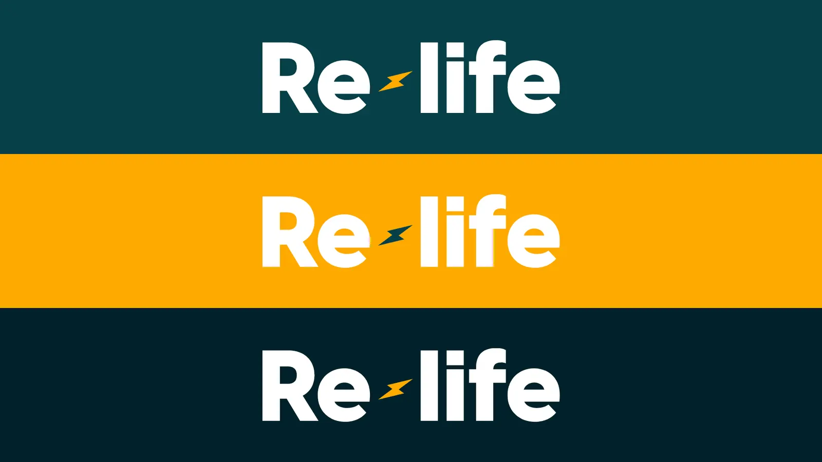
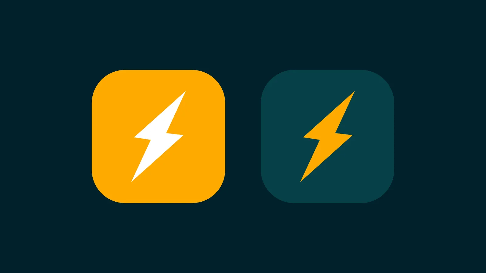
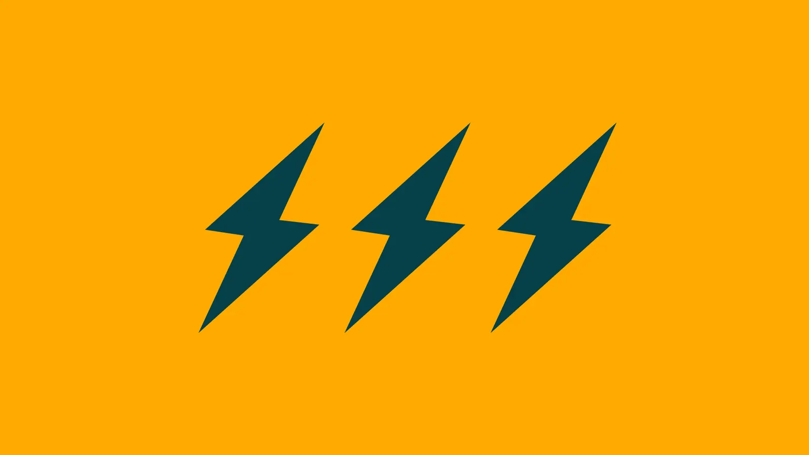
A refreshed logo, a colour palette, and icons and messaging that say sustainability and efficiency. One brand that works everywhere, from print to social media.
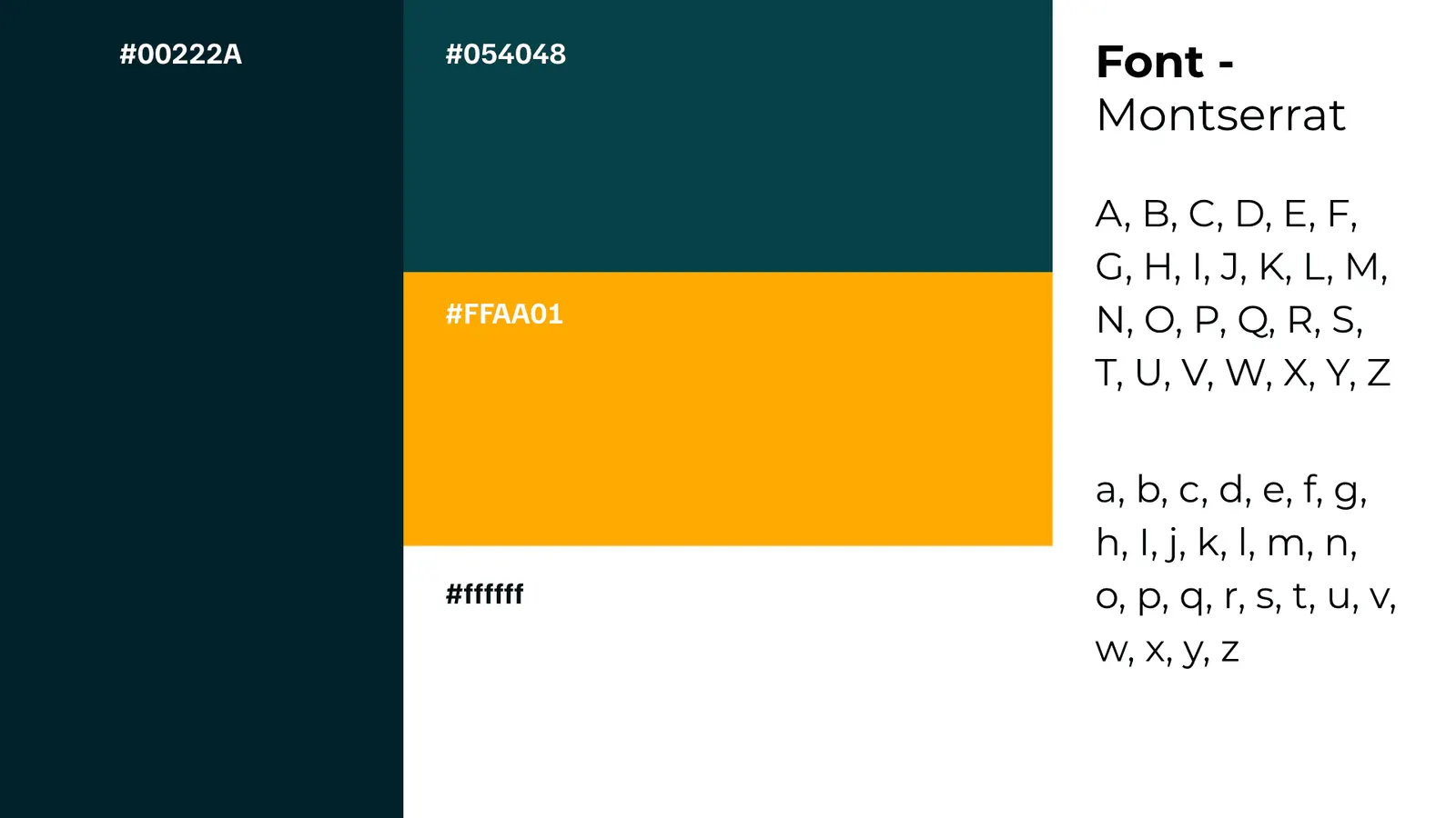
Who is it for?
Homes and businesses. The brand had to be memorable and trusted by both, so we used bold, clear visuals and plain, eco-minded messaging.
A good project with a Maltese brand that takes sustainability seriously.
Built by our founder as Building Persona, before Pembury & Stone.
More work
 Web development, Brand buildingEdits 101: design tutorials, graded
 Brand development, Web development, Content systemsCleats Hub: every cleat, weighed on the evidence
 Brand developmentSideStreet: a sharper brand before an election
 Web development, Brand buildingXjismu: a Maltese platform for discussion
 Web development, Brand developmentTminta: freelancers in Malta, found
 Brand building, Web development, Content systemsField Insider: a sports brand built on search